The Psychology of Color
By Emma Hapner, August 1, 2024
Have you ever walked into a room and felt instantly uplifted or oddly unsettled, all because of the colors around you? These feelings can be amplified in art, when the color palette of an artwork influences our emotions and perceptions. According to color theory and/or color psychology, different colors can convey different feelings and emotions. Color psychology explores how different hues can influence human emotions and even behaviors. For example, blue often evokes feelings of calm and trust, making it a popular choice for corporate environments and healthcare settings. Conversely, red can stimulate excitement and urgency, which is why it's frequently used in marketing and sales. Green, associated with nature and tranquility, is often employed to create a soothing atmosphere, while yellow can inspire creativity and energy but may also cause anxiety if overused. Understanding these associations is key in many fields, from design and branding to therapy and personal well-being, and certainly, art, enabling us to harness the power of color to positively impact our surroundings and interactions.
Johann Wolfgang von Goethe, a renowned German writer and philosopher, made significant contributions to color theory in his book Theory of Colours in 1810. Goethe's approach to color was rooted in his observations of human perception and emotions instead of the physical properties of light, which was the focus of Isaac Newton's work. Goethe's theory emphasized the psychological and emotional effects of colors on individuals. He argued that colors are not merely the result of light refraction but also have inherent emotional qualities that affect human experiences. Goethe also explored how color combinations can influence mood and perception, contributing to a deeper understanding of how colors can impact psychological states.

Pablo Picasso. The Ascetic (L' Ascète), 1903
Although Goethe's theories were not as scientifically oriented as Newton's, his work laid the foundation for the field of color psychology. He shifted the focus from the physical aspects of color to its subjective effects on human emotions, which remains a core concept in contemporary discussions about color psychology and design. One of the most well-known examples of the use of color psychology in art is Pablo Picasso’s “Blue Period”, a series of works created between 1901 and 1904 with a nearly monochromatic color palette made up almost entirely of shades of blue and other very cool tones. These works, including The Ascetic, reflected Picasso’s feelings of sadness and despair after the death of a close friend.

Jen Mann, The Dirty Lovers, 2018
The work of Canadian painter Jen Mann is another excellent example of the impact of color psychology, particularly in this work, Dirty Lovers. The use of red light to illuminate the figures here creates a mood that conveys passion, romance, and lust. Mann is a conceptual artist whose work delves deeply into the concept of self in our post-internet age. Drawing inspiration from social media and popular culture, Mann explores the nuances of identity and self-perception as shaped by the pervasive influence of the corporate gaze. Through her work, Mann invites us to reflect on how these external forces redefine our understanding of who we are. Working across a diverse array of mediums like painting, film, sculpture, and sound, she is renowned primarily for her large-scale portraiture. Her work skillfully intertwines comedy and absurdity with more profound and serious themes, creating rich emotional contrasts that invite viewers to explore the interplay between humor and depth. Through this unique blend, she offers a nuanced commentary on the human experience, capturing both the lighthearted and the introspective aspects of her subjects.

Takashi Murakami, Flower Ball, 2022
Known for his “Superflat” style, contemporary Japanese artist Takashi Murakami uses vivid, cartoon-like colors and motifs to create art that is both visually striking and thematically complex. Murakami’s work is a vibrant exploration of contemporary culture, blending elements of traditional Japanese art with modern pop aesthetics. His signature use of highly saturated colors creates a visual feast that both captivates and overwhelms the viewer, reflecting the intense, often chaotic nature of the modern world. Murakami’s art is not just a celebration of color and form but a commentary on the fusion of high and low culture, as well as the impact of consumerism and media saturation. By infusing his pieces with bold, vivid hues, he invites us to engage with the aesthetic excesses of contemporary life and challenges us to reconsider our own relationship with the visual stimuli that surround us.
JIWOO CHOI


Jiwoo Choi, originally from Seoul, South Korea and now based in New York, is a contemporary painter who’s use of color is a key element in her imagery, both conceptually and visually. Subtle themes of connection and isolation underpin her work, as she seeks to express the complex, often ineffable emotions experienced in daily life. By utilizing surface qualities such as opalescence and sheen through a delicate color palette, she aims to capture the nuanced, shifting moods of her characters, reflecting their evolving sense of self. Just as no individual is defined by a single emotion, her art challenges the notion of a fixed or pure style. Drawing from elements of academic romanticism and expressionism, she infuses her depictions—often portraying groups of women her age—with a psychological depth that resonates with authenticity and complexity.
In regards to her distinct use of color in her work, Choi wrote,
"Color is a vital component of my artistic vision, and I'm dedicated to ensuring its authenticity. To capture the unnamable complex emotions in my artwork, I engage in a process of empathetic immersion, imagining myself in their circumstances to genuinely experience their feelings. This intuitive approach enables me to distill their emotional essence into a vibrant, expressive palette that resonates with the narrative and atmosphere of my artwork."
JUSTIN COLE


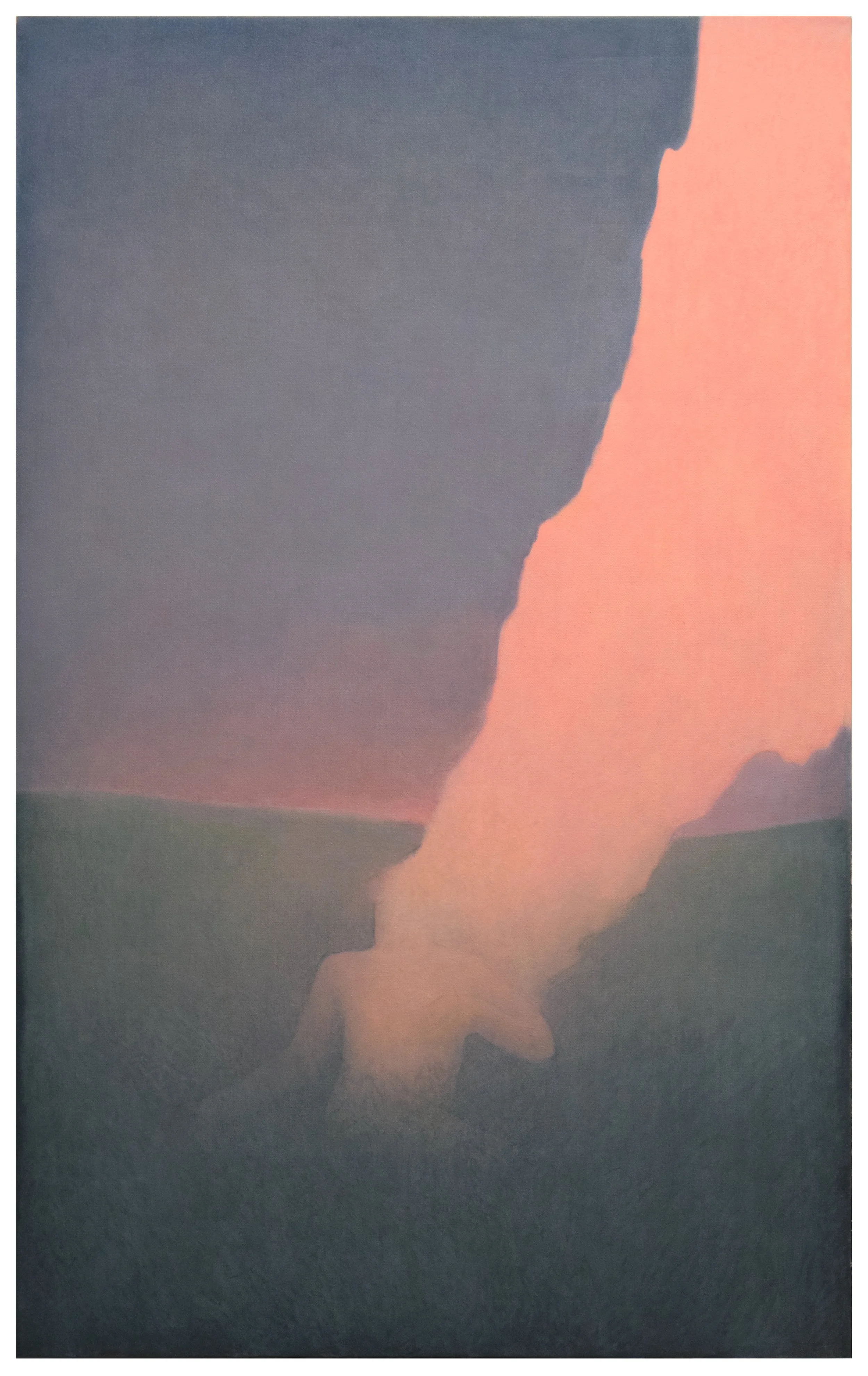
Justin Cole is a visual artist whose practice revolves around painting and drawing. A graduate of the College for Creative Studies, where he focused on illustration, Cole now resides and works in Brooklyn, NY. His art is characterized by its emotional depth rather than strict narrative structure, exploring themes such as the human condition, levels of consciousness, and mortality. A notable feature of Cole’s work is his use of a distinctly soothing pastel-esque color palette. This choice of colors not only enhances the emotional depth of his pieces but also contributes to a serene and introspective ambience. The gentle hues and soft gradients evoke a sense of calm and contemplation, inviting viewers to engage more deeply with the underlying themes of his art. Through his thoughtful approach and innovative use of color and form, Justin Cole creates a space where the viewer can reflect on the intricacies of the human condition, finding a delicate balance between the familiar and the abstract. Although his use of color appears subtle, his nuanced hues and controlled gradations create an atmosphere that is concurrently mysterious and soothing.
When asked how he uses color to express thoughts or feelings in his work, Cole responded,
“My palette is an extension of some of the themes in my work like restraint and balance. I use color to establish a sense of place; it’s a way of setting the tone. I think of my paintings as snapshots of the world or headspace I’m cultivating. Through color, I try to create a palette that is believable but not achievable with color combinations that exist in reality. “
MYCHA


Mycha, a Texas-born artist now based in Brooklyn, is celebrated for her captivating portraiture and strikingly vibrant color palette. Drawing inspiration from diverse influences such as Frida Kahlo, Catholic symbolism, magical realism, and contemporary digital illustration, her work navigates the complex interplay between identity, spirituality, and modern life. Her art functions as a vivid visual diary, offering viewers a window into the multifaceted nature of human experience through her dynamic and expressive portraits. With her graphic imagery and highly saturated colors, Mycha evokes a lively sense of joy while showcasing her exceptional design skills. By integrating a rich array of vibrant hues and profound symbolism, Mycha encourages audiences to engage with themes of femininity, LGBTQ+ identity, and the reimagining of religious iconography.
On the profound impact of color in her work, Mycha wrote,
“Color is the joy of my life. Selecting palettes is such an intuitive process for me, but if I could put it into words, I let the joy guide me. Part of my work is a celebration of femininity through the lesbian lens. A penchant for pink shows up a lot in these pieces. It feels like a rebellion to the often unsolicited “advice” that my art is too feminine and will lack mass appeal. Color is a really big part of connecting to queer femininity in my work. In my other focus, my self portraiture, I’m often telling some somber stories, but I still let joy guide color. What results is in direct contrast with some of the tough themes in my work — what people may consider bright and cheerful colors on what otherwise would be difficult stories about being human. I’m really attracted to that balance. I like that it gives a layer to peel back in order to engage with the work — challenging audiences on their perceptions of color they’ve gained over time.”
Featured Artists:
Jiwoo Choi
Website: https://www.jiwooart.com/
Justin Cole
IG: @justincole
Website: https://www.justinccole.com/
Mycha
IG: @artbymycha
Website: https://www.artbymycha.com/